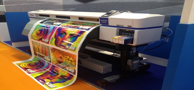
A must do, Before Large Format Printing.
Introduction:
Large format printing produces prints on a grander scale, often using specialized printers designed for wide-format outputs. These prints are usually larger than typical letter or tabloid sizes.
Calibrate Your Monitor:
Ensure accurate color representation on your printed product.
We recommend the Spyder series of calibration tools for both home and professional graphic designers.
Choose the Correct Color Space:
Understand the difference between RGB and CMYK color modes and pick the right one for your project.
Optimize Image Resolution for Viewing Distance:
Your image should be sharp and clear, whether it’s viewed from near or afar.
Raster vs. Vector:
Use the proper image format based on your design requirements.
Incorporate Bleed:
This extra image edge ensures that your final product comes out flawless.
Keep in mind Posterprintshop doesn’t need bleed for any of our trim methods, you can read more about those here.
Let’s not forget, Vibegraceprint is your ally in this journey.
With customized large format prints of up to five feet wide with unlimited lengths, high-resolution technology, and a steadfast commitment to quality, we are here to transform your business with flawless large format prints.
Stay tuned for an in-depth, step-by-step explanation on how to prepare your images for printing.
Step 1:
Optimize Your Image Resolution and DPI
Understanding Image Resolution and DPI
When we talk about image resolution, we’re referring to the detail an image has. The more pixels, or data points, an image has, the more detail it contains and the sharper it appears. DPI, or Dots per Inch, is a measure of spatial printing or video dot density. It’s the number of individual dots that can be placed within the span of one linear inch (2.54 cm).
Image Resolution and DPI
When preparing for your file for printing, a common misconception is that you need to match your source file resolution to the printer resolution. This is not the case. The more pixels in your source file, the larger you can print without losing quality. However, you don’t need a 2400 DPI source file for a 2400 DPI printer resolution. What’s crucial is the total pixel dimensions of the source file. You can save the same 2700 x 3600 pixel file at 300 dpi, 1200 dpi, and 2400 dpi – but it’s still the same 2700 x 3600 pixel source file. You can use our File Quality check to test your image to see how large it can be printed without losing quality. Check our handy file preparation guide for more tips on sizing.
Image Resolution Based on Viewing Distance
The viewing distance also plays a crucial role in how to prepare images for printing. If the viewing distance is large, the DPI can be lower. For example, a billboard viewed from 50 feet can have a DPI as low as 20. This is because from that distance, the human eye won’t be able to discern the individual dots.
So, how do you decide on the optimal DPI for your project? Start by considering your intended viewing distance. If your printed piece is going to be viewed from a distance, you can get away with a lower DPI. If it will be viewed up close, you’ll want a higher DPI to ensure the image appears sharp and clear.
In this step, remember to consider both the resolution of your image and the viewing distance of your print. By doing so, you’ll ensure your large format prints appear sharp and clear, no matter how large you go.
Step 2:
Calibrate Your Monitor and Choose the Correct Color Space
Now that you’ve optimized your image resolution, it’s time to address another crucial step: monitor calibration and choosing the correct color space.
Monitor Calibration for Accurate Color Reproduction
If you’ve ever printed an image only to find the colors look different on paper than on your screen, then you’ve experienced the importance of monitor calibration firsthand. Monitor calibration is a process that adjusts your computer screen to ensure color consistency and accuracy.
This process is particularly important when preparing images for large format printing because it can significantly impact how your final product looks. Investing in a hardware calibration tool like a colorimeter or spectrophotometer can simplify this process, as they generate a color profile for your monitor. Once you’ve installed the calibration software that comes with your tool,
follow the instructions to adjust your monitor’s settings. To maintain accurate color representation, it’s a good idea to recalibrate your monitor periodically.


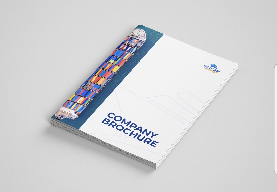
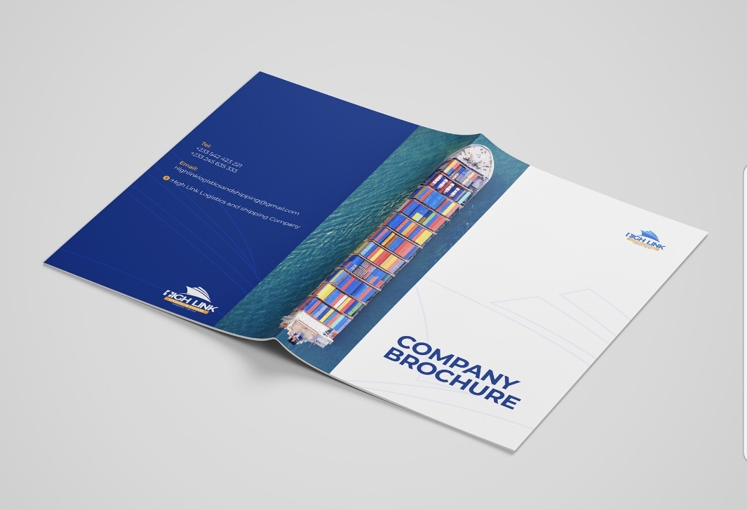
Best Practices for Brochure Printing
1. Clear design and layout: Ensure the design is clear, concise, and visually appealing.
2. High-quality images: Use high-resolution images to maintain quality when printed.
3. Paper selection: Choose paper that suits the brochure's purpose and desired finish.
4. Color accuracy: Ensure colors are accurate and consistent with brand guidelines.
5. Proofreading: Carefully proofread content for errors before printing.
6. Finishing touches: Consider finishes like gloss, matte, or folds for a professional look.
Design considerations:
1. Visual hierarchy: Organize content to guide the reader's attention.
2. Brand consistency: Align design with the company's brand identity.
3. Clear messaging: Ensure the brochure clearly communicates the intended message.
4. Readability: Use fonts and sizes that are easy to read.
Printing considerations:
1. Print method: Choose between digital or offset printing based on quantity and budget.
2. Color mode: Ensure design files are in the correct color mode (CMYK for print).
3. Bleed and margins: Account for bleed areas and margins in design.
Distribution and use:
1. Targeted distribution: Distribute brochures to relevant audiences or locations.
2. Event usage: Use brochures at events, trade shows, or in-store displays.
3. Follow-up: Consider follow-up actions like email campaigns or calls.
Tips for effective brochures:
1. Focus on benefits: Highlight benefits of products or services.
2. Include a call-to-action: Encourage readers to take a specific action.
3. Use compelling visuals: Images and graphics should support the message.
4. Keep it concise: Balance content with white space for readability.
By following these best practices, brochures can effectively communicate information and promote a company's brand.
Impact of Graphic Design in Branding
1. Visual identity creation: Graphic design helps create a brand's visual identity, including logos, color schemes, and typography.
2. Brand recognition: Consistent graphic design elements enhance brand recognition and memorability.
3. Emotional connection: Design can evoke emotions and create connections with the target audience.
4. Professionalism and credibility: High-quality design conveys professionalism and credibility.
5. Differentiation: Unique design elements help differentiate a brand from competitors.
Key aspects of graphic design in branding:
1. Logo design: A logo is a critical element of a brand's visual identity.
2. Color palette: Colors evoke emotions and contribute to brand recognition.
3. Typography: Fonts and typography convey the brand's personality and tone.
4. Imagery and icons: Consistent use of imagery and icons reinforces brand identity.
Benefits of effective graphic design in branding:
1. Consistency across touchpoints: Consistent design builds a cohesive brand experience.
2. Increased brand loyalty: Strong visual identity can foster loyalty and trust.
3. Enhanced communication: Design helps communicate the brand's message and values.
4. Memorable brand experience: Effective design creates a lasting impression.